

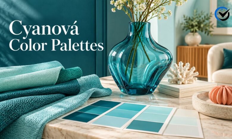
The word “cyanová” refers to cyan in Czech and Slovak adjective forms. For a reader exploring color, it points toward a bright blue-green family that can feel crisp, calm, or energetic depending on its shade and surroundings. This guide looks at practical ways to use cyan in home decor, clothing, and digital design, with palette ideas and advice for choosing colors that work well together.
What Cyanová Means in Color
Cyan sits between blue and green on the color wheel. It can range from pale, airy tints to deep, saturated tones, so two colors described as cyan may look quite different. The adjective form does not identify one fixed paint or screen color. When planning a palette, it helps to choose a specific shade first and then consider its brightness, intensity, and undertone.
The Character of Cyan
Light cyan can make a space feel open and fresh, while deeper versions often feel more confident and modern. Its blue component may suggest coolness and clarity; its green component can make it feel lively and natural. These impressions are not universal rules. Nearby colors, lighting, surface texture, and personal associations all change how a shade is perceived.
Start With a Clear Palette Plan
Before selecting companion colors, decide what the palette needs to do. A bedroom scheme may aim for softness, while a sports poster or shop display may need strong contrast. Choose one main cyan shade, then assign supporting colors specific roles: background, trim, text, furniture, or accents. This prevents every color from competing for attention.
Soft Neutrals for a Calm Look
Pair a pale cyan with warm white, cream, light gray, or sand for a gentle, easy-to-live-with palette. The neutral shades give the eye a resting place and help the blue-green color feel more subtle. This combination works well for bedrooms, bathrooms, reading corners, and brand layouts that need to feel clean without appearing stark.
Coastal Colors Without a Theme
Cyan can sit naturally beside muted navy, driftwood brown, soft white, and sandy beige. The mix recalls water and shorelines without requiring decorative motifs such as shells or anchors. Use the brighter shade in small areas, such as a cushion or painted shelf, and let the quieter colors cover larger surfaces for a balanced result.
High-Contrast Combinations
For a bolder palette, combine cyan with navy, charcoal, or near-black. Dark colors make the lighter blue-green appear brighter and give a layout or room a sharper outline. This pairing suits feature walls, product packaging, sports graphics, and modern accessories. Keep the darkest shade in controlled areas so the overall effect remains clear rather than heavy.
Warm Accents That Add Energy
Coral, muted orange, terracotta, and soft peach can bring warmth to a cool cyan palette. Since these colors sit across the color wheel from blue-green, even a small amount can create a lively contrast. Try a cyan background with a few warm details, or use the warm shade as the main color and add cyan through trim or accessories.
A Layered Monochromatic Palette
A monochromatic scheme uses several variations of one color family. Combine pale aqua, medium cyan, teal, and a darker blue-green to create depth without introducing many unrelated hues. Varying brightness is essential: if every shade is equally saturated, the palette may feel flat. Add a neutral such as white or gray to separate areas and improve readability.
Using Cyan in a Living Room
In a living room, cyan can appear on one accent wall, a pair of chairs, curtains, or smaller accessories. A full room of saturated color may feel intense, especially in a space with strong daylight. Balance it with wood, woven textures, or neutral upholstery. Repeating the shade in two or three places helps the room feel intentional.
Color Choices for Kitchens and Bathrooms
Cyan works well in kitchens and bathrooms because it can look crisp beside white tile, pale stone, and brushed metal. Cabinet fronts, towels, dishes, or a backsplash can introduce the color without committing every surface to it. Consider how the shade looks beside fixed materials, such as countertops and flooring, because these are harder to change later.
A Softer Approach for Bedrooms
For a restful bedroom, choose a light or muted cyan rather than a highly saturated version. Pair it with soft white, pale wood, oatmeal, or gray bedding. The color can appear on a wall, duvet cover, or curtains, while smaller accents in navy or green add definition. Test the shade at different times of day before painting a large area.
Making Small Spaces Feel Open
Pale cyan can help a compact room feel brighter when it receives enough light, especially alongside a light ceiling and uncluttered surfaces. It does not automatically make every small space appear larger; dark corners and crowded furniture still affect the impression. Use a consistent palette across nearby areas to reduce visual breaks and make the layout feel more connected.
Styling Cyan in Clothing
In clothing, cyan can serve as a statement piece or a small accent. A cyan shirt can pair with denim, white, gray, or navy, while a scarf, bag, or shoes can add color to a neutral outfit. For a more adventurous look, try a warm accent such as rust or coral. The best balance depends on the shade and the wearer’s preference.
Digital Design and Screen Colors
On screens, cyan often appears bright and clean, making it useful for buttons, charts, illustrations, and visual accents. A large, highly saturated area can become tiring, so it is often more effective for highlights than for long blocks of text. Choose text and background colors with strong contrast, and check the design on more than one screen.
Print and Physical Materials
A color that looks vivid on a monitor may print differently because screens create light while printed surfaces reflect it. Paper, fabric, paint, and plastic each affect how cyan appears. If color accuracy matters for packaging, invitations, or a coordinated room, request a physical sample or proof. A digital preview alone cannot guarantee a precise match.
Readability and Color Contrast
When cyan appears behind text, contrast deserves careful attention. Pale cyan may not separate enough from white, while bright cyan can make small lettering difficult to read. Dark navy or charcoal text is often easier to distinguish, but test the actual combination at its intended size. In digital work, do not rely on color alone to communicate meaning; add labels, shapes, or symbols.
How Lighting Changes the Shade
Natural daylight, warm bulbs, cool bulbs, and shadows can all shift the appearance of a painted or printed color. A cyan that looks blue in one room may appear greener in another. Check samples near the surface where they will be used and observe them in morning, afternoon, and evening light. This simple step can prevent a costly mismatch.
Choosing the Right Shade
Start by comparing a few samples rather than choosing from a color name alone. Decide whether you want a shade that leans more blue, more green, or toward a muted gray. Then compare its lightness and saturation with the other colors in the room or design. A useful palette usually has variation in tone, not just a collection of equally bright colors.
Common Palette Mistakes
One frequent mistake is using too many saturated colors at once. Another is selecting a cyan from a screen and assuming it will look identical on a wall, fabric, or printed page. A palette can also feel disjointed when its warm and cool colors have no shared neutral or repeated accent. Limit the strongest colors and test the combination in its real setting.
A Practical Way to Test Combinations
Place paint chips, fabric swatches, or printed samples together under the lighting where they will be used. For digital designs, view the palette on a phone and computer, then check text contrast at normal size. Look at the colors from a short distance as well as up close. A combination that works in a small sample may feel much stronger across a large surface.
Final Thoughts
Cyanová points to a flexible blue-green color family rather than a single universal shade. It can feel quiet beside warm neutrals, crisp with white, dramatic with navy, or energetic with coral and orange. The most useful palette begins with a clear purpose and a chosen shade. Testing colors in their actual light and materials helps turn an appealing idea into a combination that works in everyday use.
Frequently Asked Questions
1. Is cyanová a specific color code?
No. It describes a color family in Czech and Slovak adjective forms, not one universal hex code, paint number, or pigment. To reproduce a particular shade, use a named standard or record its specific digital or manufacturer color value.
2. Is cyan the same as turquoise?
They overlap, but the names do not always refer to identical shades. Cyan is generally described as a blue-green color, while turquoise often leans greener and may appear softer or more stone-like. Exact usage varies among design systems and product makers.
3. Which colors pair well with cyan?
White, cream, gray, navy, charcoal, sand, and natural wood are reliable companions. Coral, peach, and muted orange add warmer contrast. The best match depends on the cyan’s brightness and whether the palette should feel calm, polished, or lively.
4. Does cyan work in a bedroom?
Yes. A pale or muted shade can add color without dominating the room, especially when paired with soft neutrals and natural materials. For a restful effect, use highly saturated cyan in limited areas and check the color in evening light.
5. Can cyan make a small room look larger?
A light shade may help a room feel brighter and more open, but color alone cannot change its size. Lighting, furniture scale, storage, and visual clutter matter too. Pairing pale walls with a light ceiling can support an airy impression.
6. Is cyan suitable for clothing?
Yes. It works as a main garment color or as a smaller accent in a bag, scarf, or shoes. Denim, navy, white, and gray are easy pairings. Coral or rust can create a stronger contrast for those who prefer a more vivid outfit.
7. Why does cyan look different on my screen?
Screens vary in brightness, color settings, and display technology. The surrounding colors and room lighting also affect perception. If the exact shade matters, compare calibrated displays or consult a physical color sample rather than relying on one screen.
8. What text color is easiest to read on cyan?
Dark navy or charcoal often provides clearer contrast than white on a bright or pale cyan background. The result depends on the exact shades and text size, so test the combination at its intended scale, especially for small labels and body text.
9. Can cyan and green be used together?
Yes. Choose shades with enough difference in lightness or saturation so they remain distinct. A muted green with bright cyan can feel balanced, while similar blue-green shades may blend together. A neutral separator can help clarify the palette.
10. How can I test a cyan color before using it?
For paint or fabric, place a physical sample in the intended space and check it under different lighting. For digital work, review the palette on multiple screens and test text contrast. Small samples and proofs help reveal mismatches before a larger commitment.
Recommended: Doujin Moe: A Reader’s Guide to Finding Stories and Web Novels





One Comment